How to Use Payoff Diagrams to Visualise Options Strategy Risk
Blog by Aliceblue News Desk
29 June 2026
13 minutes
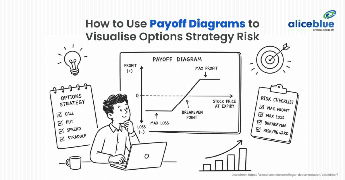
Picture this. You bought a Nifty call option two days before the Union Budget. You called the direction right. Nifty moved up on Budget day. Your option barely moved. The reason was simple: you never checked the breakeven price before entering. You needed Nifty to rise by 300 points just to recover the premium you paid. The market gave you 200.
This situation plays out in Indian options markets every week. A payoff diagram, also called an options P&L chart or options risk graph, shows you the exact breakeven, maximum loss, and maximum profit of any options strategy before you place the trade. If you are new to options, start with What Is Options Trading and Difference Between Futures and Options before continuing here.
What Is an Options Payoff Diagram?
A payoff diagram is a graph that shows your profit or loss across every possible price of the underlying asset at expiry. The horizontal axis shows price levels of the underlying, such as the Nifty 50. The vertical axis shows the rupee profit or loss your position generates at each price.
The line running across the chart is your payoff line. Every point on it answers one question: if Nifty closes at this price on expiry day, how much do I make or lose?
Three reference points on every option’s risk graph matter:
- Breakeven point: Where the payoff line crosses the zero line. You make nothing and lose nothing at this price.
- Maximum loss: The lowest flat level on the left side of the diagram. This is the worst possible outcome, regardless of how far the market moves against you.
- Maximum profit: Either a flat ceiling showing a capped gain or an upward slope showing theoretically unlimited profit as the market moves further in your favour.
A standard payoff diagram shows results at expiry only. It does not show what happens to your trade value on day three of a fifteen-day position. For that, you need the current day P&L line available on platforms like Alice Blue, ANT and Sensibull.
The Two Lines on an Options Payoff Chart
Open the strategy builder on Alice Blue ANT, and you will see two lines on the chart.
The solid line shows your profit or loss at expiry, assuming you hold the position until the last day of the contract.
The dotted line shows your current day P&L based on today’s option premiums and current implied volatility.
Most Indian options traders who exit early and take unnecessary losses do so because they track the solid expiry line mentally while their actual position tracks the dotted current-day line. If you are exiting a trade in five days, the dotted line is what matters. The solid line becomes relevant only if you hold until expiry.
To understand why implied volatility affects the dotted line so much, read Theta in Options Trading: Time Decay Explained.
How to Read an Options Risk Graph Step by Step
Step 1: Identify the price range on the horizontal axis.
If Nifty is at 22,000, the chart typically spans from 20,000 to 24,000 with the current price near the centre.
Step 2: Find the breakeven point.
For a long call on Nifty 22,000 CE bought at 150 premium, the breakeven is 22,150. Formula: Strike Price + Premium Paid = Breakeven.
Step 3: Check the maximum downside.
For the options you buy, find the flat section on the left side of the diagram. That flat level equals the total premium paid. For a 150 rupee premium on a lot of 65 units (current Nifty lot size as of January 2026), the maximum loss is 9,750 rupees, no matter what Nifty does.
Step 4: Check the maximum upside.
For a plain long call, the payoff line rises indefinitely to the right. For spread strategies, the line flattens at a capped profit level. That ceiling is the maximum you can make from the trade, locked in before you enter.
Real Example: Nifty Options Payoff Chart for a Bull Call Spread
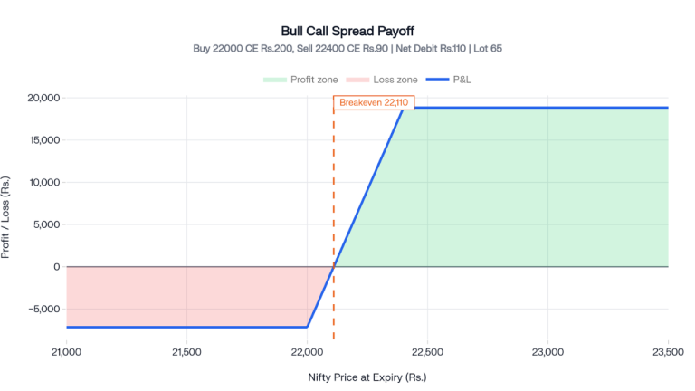
Nifty is trading at 22,000. You expect a moderate rise before the monthly expiry. A plain long call costs too much. You set up a Bull Call Spread:
- Buy Nifty 22,000 CE at 200 premium
- Sell Nifty 22,400 CE at 90 premium
- Net cost paid: 110 rupees per unit
- Lot size: 65 units (revised by NSE effective January 2026)
- Total capital at risk: 7,150 rupees
Formula verification:
- Maximum loss = Net premium paid x lot size = 110 x 65 = Rs. 7,150
- Maximum profit = (Spread width minus net premium) x lot size = 290 x 65 = Rs. 18,850
- Breakeven = Lower strike + net premium = 22,000 + 110 = 22,110
Nifty Price at Expiry | Outcome | P&L |
Below 22,000 | Both calls expire worthless | Rs. 7,150 loss (maximum loss) |
22,110 | 22,000 CE has 110 intrinsic value | Rs. 0 (breakeven) |
22,250 | 22,000 CE is worth 250, net gain 140 per unit | Rs. 9,100 profit |
22,400 and above | Maximum spread value reached | Rs. 18,850 profit (maximum profit) |
Payoff Shapes of Common Options Strategies
Long Call: Hockey Stick Shape
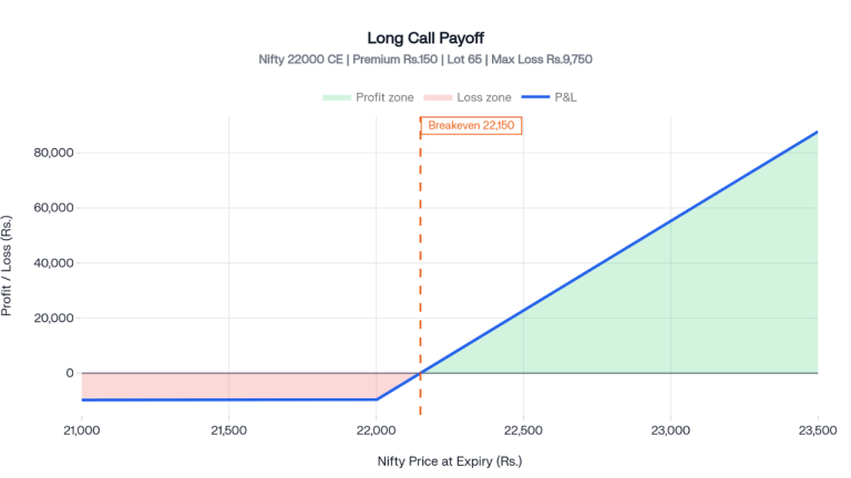
The flat section on the left shows the maximum loss limited to the premium paid. The line rises steeply to the right once Nifty crosses the strike. Maximum profit is theoretically unlimited.
Long Put: Reverse Hockey Stick
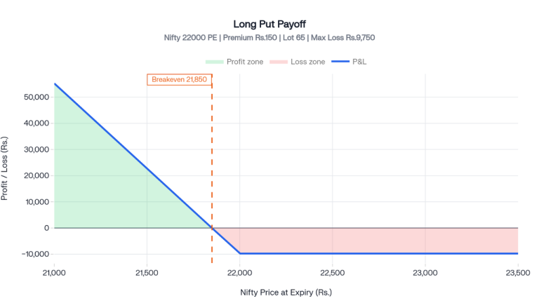
Rises to the left as the underlying falls below the strike. Flat on the right at the premium paid level. Maximum loss is limited to the premium paid. Maximum profit grows as Nifty falls toward zero.
Long Straddle: V Shape
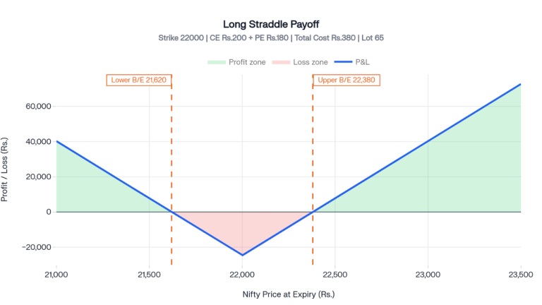
You buy both a call and a put at the same strike. The diagram forms a V shape with two breakeven points:
- Upper breakeven = Strike + Total Premium Paid = 22,000 + 380 = 22,380
- Lower breakeven = Strike minus Total Premium Paid = 22,000 minus 380 = 21,620
If Nifty stays between both breakeven points at expiry, you lose the combined premium. If Nifty breaks out sharply in either direction beyond either breakeven, the trade becomes profitable. Read the full strategy guide: Mastering Long Straddle Options Strategy.
Iron Condor: Inverted Trapezoid Shape
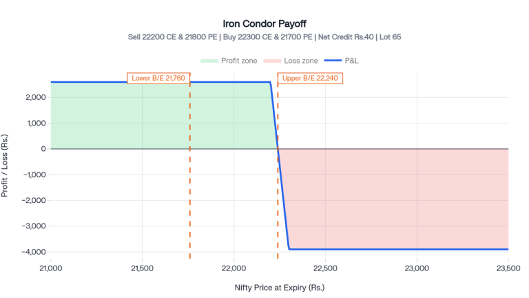
A four-leg strategy is used when you expect Nifty to stay within a range. You sell an out-of-the-money call and an out-of-the-money put while buying further out-of-the-money options on both sides as protection.
Example with Nifty at 22,000:
- Sell 22,200 CE and Buy 22,300 CE (call spread)
- Sell 21,800 PE and Buy 21,700 PE (put spread)
- Net credit collected: 40 rupees per unit
- Total credit per lot: Rs. 2,600 (65 units)
- Maximum loss: Rs. 3,900 beyond either breakeven
How to Build a Nifty Options Payoff Chart on Alice Blue ANT
- Log in to ANT Web or the ANT mobile app
- Go to the Options section and open the Strategy Builder
- Select the underlying, such as Nifty 50 or Bank Nifty
- Add each trade leg: strike price, expiry date, buy or sell, and quantity
- The platform generates the payoff chart showing the solid expiry line and the dotted current day P&L line
- Check the breakeven, maximum profit, and maximum loss shown below the chart
- Adjust strikes or quantities if the risk profile does not match your plan, then place the order
Advantages of Using Payoff Diagrams
- The exact downside is visible before entry.
You see the worst-case rupee loss before spending anything. If the maximum loss on a trade is 14,000 rupees but your account rule limits single trade risk to 7,000 rupees, the chart shows this before you place the order. - Strategy comparison becomes practical.
Choosing between a long straddle and a long strangle for an RBI policy day? The two charts side by side show which one costs less, which breakeven is more realistic, and which suits your expected move size. - Multi-leg strategies become clear.
A four-leg iron condor is difficult to evaluate mentally. The combined payoff chart reduces the entire position to one line showing net profit or loss at every price level. - Exit targets become defined.
Once the maximum profit level is visible on the chart, you can set a price alert and exit at the right level instead of guessing when to close the position.
For traders who want to go further, How to Build a Consistent Options Trading System and F&O Trading Psychology are useful next reads.
Limitations of Payoff Diagrams
- Implied volatility is not reflected in the base expiry diagram.
A sharp drop in implied volatility after an event such as IV crush on Budget Day can reduce your option premium significantly, even if Nifty moves in your favour. The standard expiry payoff line does not capture this. The dotted current-day line on Alice Blue ANT and Sensibull gives an IV-adjusted view. - Time decay erodes value daily.
The expiry diagram assumes you hold until the last day. Theta erodes option value every single session. If Nifty hits your target three weeks before expiry, actual profit will be lower than the expiry line suggests because the premium still contains time value. Read more: Theta in Options Trading: Time Decay Explained. - Transaction costs shift your breakeven.
Brokerage, STT, GST, and SEBI charges are not deducted in the standard payoff chart. For low-premium trades, these charges move your actual breakeven by a meaningful number of points. - Not useful for very short-duration scalp trades.
If you are buying and selling an option within fifteen minutes based on live premium movement, the expiry payoff diagram is irrelevant. Your outcome depends on real-time premium changes, not the expiry value.
Payoff Diagram Versus Profit and Loss Chart
Feature | Payoff Diagram | P&L Chart |
What it measures | Intrinsic value of the option at expiry | Net profit or loss after deducting the premium paid |
Zero reference line | Set at the strike price | Set at the breakeven point |
Includes premium paid | No | Yes |
Better suited for | Understanding option theory | Making real trading decisions |
For every real trading decision, use the P&L chart. It shows what actually lands in your account.
Common Mistakes Beginners Make
- Expecting profit the moment the price crosses the strike.Breakeven is Strike + Premium Paid, not just the strike. Buying a Nifty 22,000 CE at 150 rupees means you need Nifty above 22,150 at expiry to make any money. Many beginners close trades, thinking they are losing when they are simply a few points short of breakeven.
- Watching only the solid expiry line while trading the dotted line reality.
If you plan to exit in four or five days, the dotted current day line is what reflects your actual position value. Anchoring to the expiry outcome while operating on a shorter time frame leads to poor exit decisions. - Evaluating each trade leg separately instead of viewing the combined chart.
A bull call spread has a long call and a short call. Each leg viewed alone looks risky. The combined payoff chart tells the actual story of the trade. Always view the net chart of the full strategy. - Treating capped profit as a disadvantage.
A flat ceiling on the payoff diagram means profit is capped, but it also means cost and maximum loss are capped. A 7,150 rupee spread with an 18,850 rupee maximum profit is often a better risk-adjusted choice than a 13,000 rupee outright long call with unlimited theoretical upside that rarely materialises.
To understand how to hedge your portfolio using these strategies, see How to Hedge Your Stock Portfolio Using F&O in India.
Who Should Use Payoff Diagrams
Suited for:
- Beginners placing their first options trades who want clear numbers before entering
- Traders running multi-leg strategies where mental calculations become unreliable
- Anyone trading around scheduled events like the Budget, the RBI policy, or the quarterly results
- Traders choosing between two strategies and needing an objective risk comparison
For a broader picture of where options fit against equity investing, read F&O vs Equity Delivery for Long Term Wealth.
Less relevant for:
- Scalpers entering and exiting within minutes based on live premium ticks
- Fully automated systems that manage position-level risk at the algorithm level
Conclusion
Most options traders who lose money on technically correct directional calls do so because they never checked the breakeven before entering. The payoff diagram fixes this. It shows maximum loss, breakeven price, and profit zone at a glance before capital is committed. Open the Alice Blue ANT strategy builder, add your trade legs, look at the chart, and then place the order. Also explore
Diagonal Spread Options in India and Max Pain in Options for more advanced reading, once you are comfortable with payoff diagrams.
To start trading options with zero brokerage on equity delivery, Open Your Free Alice Blue Account Here.
Frequently Asked Questions
A payoff chart shows profit or loss at every possible price of Nifty or a stock at expiry. The horizontal axis shows price levels, and the vertical axis shows rupee profit or loss. It gives you the full risk-and-reward picture of a trade before you place it.
For a long call, the formula is Strike Price + Premium Paid = Breakeven. If you buy a Nifty 22,000 CE at 150 rupees, the breakeven is 22,150. On the payoff chart, this is where the payoff line crosses the zero line.
The dotted line shows your current day P&L based on today’s option premiums and implied volatility. The solid line shows the outcome if you hold until expiry. For trades you plan to exit early, track the dotted line, not the solid one.
No. The standard expiry payoff diagram shows the outcome on expiry day only. It does not show how time decay reduces position value daily. To track theta impact, use the current day P&L line on Alice Blue ANT or Sensibull.
A V shape represents a long straddle or long strangle. You profit if the underlying makes a large move in either direction. If the price stays flat near the strike at expiry, you lose the total premium paid.
Open the Strategy Builder in ANT Web or the app, select your underlying, add your option legs with strike, expiry, and quantity, and the platform generates the payoff chart automatically with breakeven, maximum profit, and maximum loss displayed below the chart.
Yes. Strategies like bull call spreads cap the maximum profit but also the maximum loss, and cost less than outright options. For moderate directional moves, which occur far more frequently than large breakouts, spread strategies deliver better risk-adjusted returns than plain long calls or puts.

Blog by Aliceblue News Desk