10 Stock Chart Patterns Every Beginner Should Know
Blog by Aliceblue News Desk
16 October 2026
13 minutes
Quick Answer
A share rises, pulls back, and rises again. Is it taking a break, or is the move ending? Chart patterns in trading help you examine questions like this. They are shapes formed by price movements over time. This guide covers 10 common patterns, what each looks like, and the price level traders watch. No pattern can tell you with certainty where a stock will go next.
The accompanying illustrated guide contains an original, labelled diagram for each of the 10 patterns. The diagrams are concept sketches, not charts of actual stocks.
Table of Contents
- What are stock chart patterns?
- Which 10 chart patterns should you know?
- How do you read a chart pattern?
- What does a double-bottom trade look like?
- What are the benefits and risks?
- What mistakes should beginners avoid?
- Chart patterns vs candlestick patterns
- Who can use chart patterns?
- Frequently asked questions
What Are Stock Chart Patterns?
A stock chart plots price over time. A chart pattern is a shape you can see when the price repeatedly rises, falls, or moves between certain levels. Traders use these shapes to consider whether an existing price move might continue, change direction, or remain stuck in a range.
Two terms will make the patterns easier to understand:
Support is an area where a falling price has stopped or bounced before.
Resistance is an area where a rising price has stalled before.
Neither is an exact wall. A stock can move slightly past a level and then turn back. That is why traders look at what happens after price reaches the area, rather than assuming the line will hold.
You will also see the word trend in this article. It simply means the general direction in which the price has been moving: up, down, or sideways. A pattern suggesting that a trend may turn is called a reversal pattern. A shape suggesting the trend may resume after a pause is called a continuation pattern. Both can fail.
Which 10 Chart Patterns Should You Know?
You do not need to memorise all 10 at once. For each one, look at the shape, then find the level to watch marked in the accompanying diagram.
1. Head and shoulders
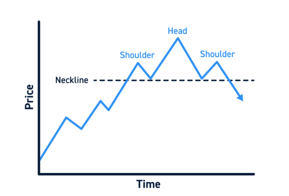
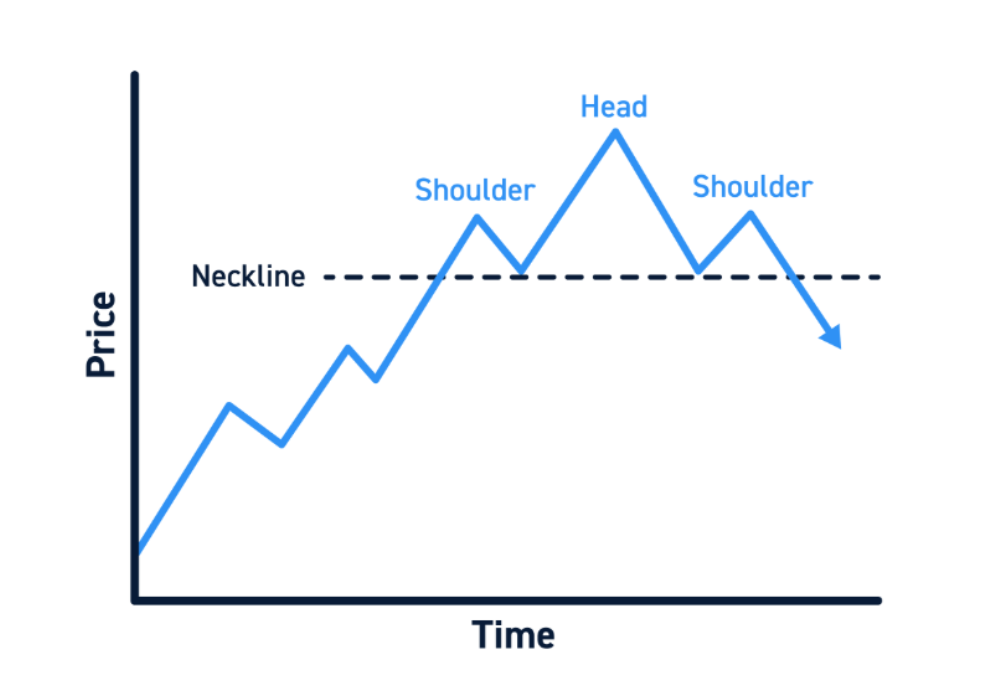
After a stock has risen, its price makes three peaks. The middle peak is the highest; the third is lower than the middle one. It resembles a head between two shoulders.
Join the two dips between those peaks. The resulting line is called the neckline. Traders watch whether price falls below it. Three peaks alone do not show that the earlier rise has ended; the move below the neckline is the part that matters.
2. Double top
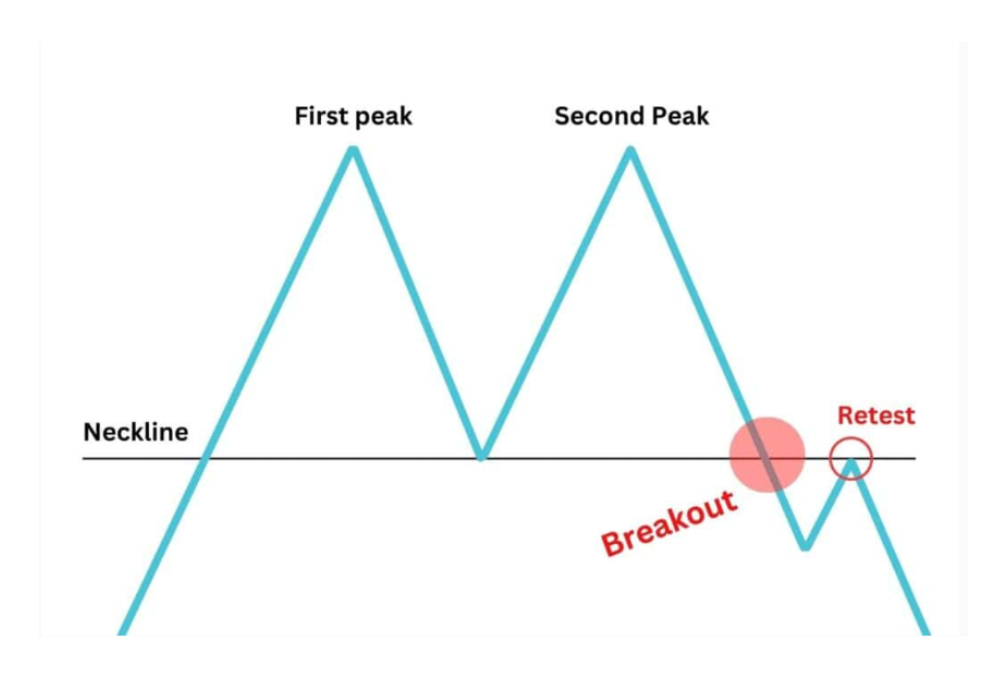
A double top looks roughly like an M. The share reaches a high, falls, climbs towards a similar high, and falls again.
The price level to watch is the low between the two tops. A move below that low suggests the earlier upward trend may be weakening. The two highs do not have to match exactly to the rupee.
3. Double bottom
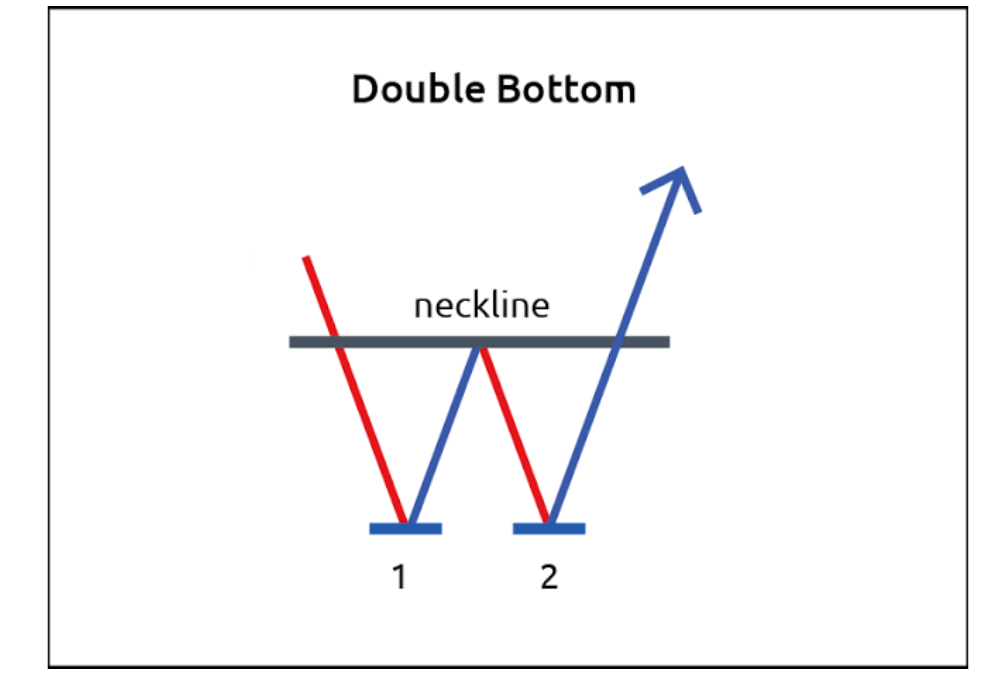
A double bottom looks roughly like a W. The share falls to a low, rebounds, falls to around the same area and climbs again.
This time, watch the high between the two lows. If price rises above it, buyers have moved past the earlier rebound high. The W shape alone is not a buy signal: a share can make two similar lows and still fall further.
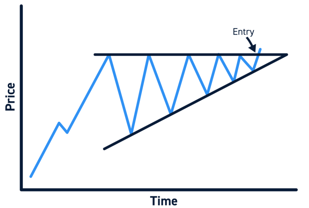
4. Ascending triangle
Imagine a fairly flat line across several price highs. Beneath it, each new low is higher than the last. Together, the lines form an ascending triangle.
The repeated highs show where the price has been held back. Traders watch for it to move above that upper level. The higher lows may suggest buyers are stepping in sooner, but an upward break is not guaranteed.
5. Descending triangle
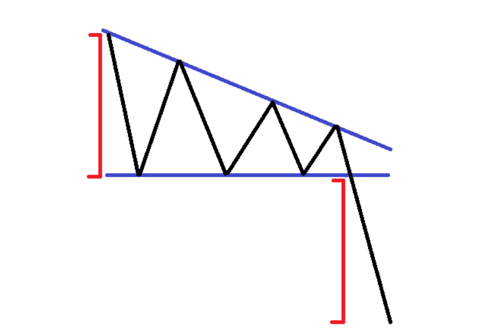
A descending triangle has the opposite shape. The price repeatedly falls towards a similar low, while each rebound reaches a lower high.
The lower line is the level to watch. A move beneath it suggests the price has fallen out of the area where it had previously found buyers. Until then, that lower area may continue to hold.
6. Symmetrical triangle
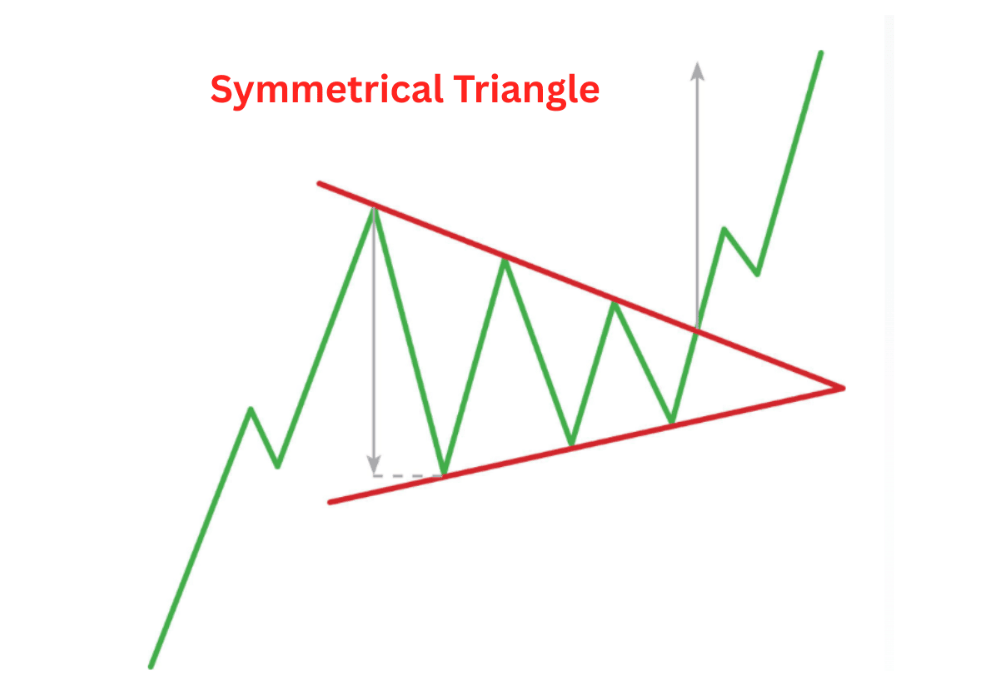
Here, the highs become lower, and the lows become higher. The two sides close in on each other, and price moves within a narrowing space.
Do not guess the direction from the name or the shape. Mark both sides of the triangle and watch which one price crosses. It may move up, move down, or briefly cross a line before returning inside.
7. Bull flag
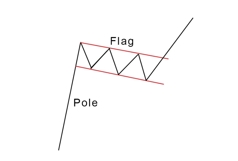
A bull flag begins with a sharp rise. Price then pauses or pulls back for a shorter period, often sloping gently against the earlier upward move. The rise resembles a flagpole; the pause resembles a flag.
Traders watch for a move above the top of that short pullback. If the stock keeps falling instead, the idea that it was merely pausing before another rise may be wrong. An ordinary sideways spell after a modest rise is not automatically a bull flag.
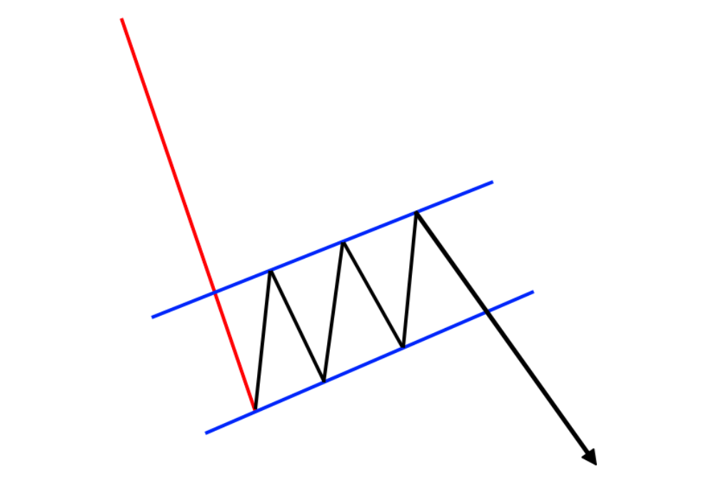
8. Bear flag
A bear flag starts with a sharp fall. It is followed by a shorter recovery that often slopes gently upwards, against the earlier downward move.
The bottom of that recovery is the level to watch. A fall below it may suggest the downward move is resuming. If you buy shares for delivery rather than trade falling prices, this pattern may prompt you to review your holding and risk plan, not automatically sell it.
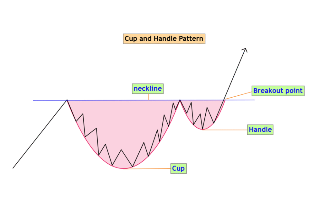
9. Cup and handle
The price falls and gradually recovers, forming a rounded U. Near its previous high, it dips again on a smaller scale. That smaller dip is the handle.
Traders watch whether price moves above the handle’s upper edge. The rounded recovery takes time to develop; a quick fall and sharp bounce need not be a cup and handle.
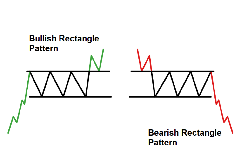
10. Rectangle
A rectangle forms when price repeatedly moves between a fairly clear upper area and lower area. It looks as though the stock is trading inside a box.
The price has not shown a clear new direction while it remains inside that box. Traders watch whether it moves above the top or below the bottom. Either move can fail and return inside the range.
How Do You Read a Chart Pattern?
Seeing a familiar shape is only the first step. Use this sequence before deciding whether it means anything for a trade:
- Look at the earlier price move. Was the share generally rising, falling, or moving sideways? A possible reversal makes more sense when there is an earlier trend to reverse.
- Mark the highs and lows. Draw your lines using price points you can clearly identify. If you have to force the shape onto the chart, leave it alone.
- Choose the level to watch. For a double bottom, it is the high between the lows. For a rectangle, it could be the upper or lower edge.
- Wait for price to cross that level. A move beyond an upper level is commonly called a breakout. A move below a lower level is often called a breakdown. Price can cross a level during the trading session and then move back before the close.
- Check volume. Volume is the number of shares traded during the period you are viewing. Higher trading activity around a break can add context, but it cannot prove the move will last.zerodha+1
- Plan what you will do if you are wrong. Decide the price at which you would try to exit and calculate the possible loss before choosing how many shares to buy.
What Does a Double-Bottom Trade Look Like?
Suppose an illustrative NSE-listed share falls to ₹480, climbs to ₹520, slips to ₹482, and rises again. The two lows form a rough W. The high between them—₹520—is the level to watch.
Now suppose the share closes above ₹520. A trader buys 100 shares at an assumed price of ₹524 in the next trading session. Before buying, they decide to try to exit if the price falls to ₹508. That ₹508 figure is an illustrative choice below the ₹520 breakout level, not a rule for placing an exit in every double-bottom trade.
Item | Calculation | Amount |
Amount paid for shares | ₹524 × 100 | ₹52,400 |
Planned price risk | (₹524 − ₹508) × 100 | ₹1,600 |
Gross gain if sold at ₹550 | (₹550 − ₹524) × 100 | ₹2,600 |
The amounts exclude charges and taxes. The ₹508 exit is not a guaranteed selling price. If the share opens below it, for instance, after closing at a higher price the previous day, or an order fills lower, the loss can exceed ₹1,600. This example shows how to assess a possible trade, not where any real stock will go.
What Are the Benefits and Risks?
The benefit: a pattern gives you something specific to wait for. Instead of deciding that a stock “looks ready,” you can mark the high between two lows and see whether price moves past it. You can also decide in advance what price move would show that your reading did not work.
The risk: the move past that line may not last. Price can break out and then return to its earlier range. This is a false breakout, and it is one reason a planned exit matters.
There are other limits to keep in mind:
- Two people may draw slightly different lines on the same chart.
- Low trading activity or a fast price move can make an exit difficult at the intended price.
- A chart shows price behaviour; it does not explain a company’s finances or future announcements.
- Seeing a pattern you recognise can tempt you to enter before the price reaches the level you meant to watch.
For a longer-term investment decision, studying the company matters alongside studying its price.
What Mistakes Should Beginners Avoid?
Start with two or three patterns, such as a double bottom, a triangle, and a rectangle. Mark the level you would watch before seeing the next move. Looking back at a finished chart makes a pattern appear more obvious than it was while it was forming.
Common mistake | Better approach |
Buying because a W is beginning to appear | First mark the high between the lows and watch what price does there |
Calling every pause a flag | Look for a clear earlier sharp move and a shorter pause that generally slopes against it |
Treating a breakout as a promise | Decide where you would try to exit if price moves back |
Choosing the number of shares without calculating risk | Work out the possible rupee loss for that number of shares first |
Labelling every uneven price move | Skip charts whose boundaries you cannot explain clearly |
If you use a candlestick chart, first learn what one candle shows. It will be easier to understand a larger pattern when you know how price is displayed within each trading period.
Chart Patterns vs Candlestick Patterns
These are related, but they do not describe the same thing.
Question | Chart pattern | Candlestick pattern |
What do you examine? | A broader shape formed over several price moves | One candle or a short group of candles |
Example | Double bottom or triangle | Hammer or engulfing pattern |
What can it help you see? | A possible turn, pause, or move beyond a wider price area | How price behaved over a shorter period |
You can look at a candle near a chart-pattern boundary, but the candle does not replace the wider view.
Who Can Use Chart Patterns?
A swing trader, who may hold a position for more than one trading session, can study patterns on a daily chart and plan a possible entry and exit. An intraday trader may see the same shapes on a shorter chart but must make decisions more quickly. A long-term investor can use a chart to understand recent price movement while still researching the company itself.
Chart patterns are less useful as a stand-alone method for someone who cannot decide how much they can afford to lose or who finds it difficult to follow an exit plan. A recognisable shape is not, by itself, a reason to place a trade.
Conclusion
Stock chart patterns give names to price movements you can see: repeated highs and lows, a short pause after a sharp move, or a share trading inside a range. The useful question is not just “Which pattern is this?” but “Which price level matters, and what will I do if the move fails?” Start with a few patterns and study them on charts before risking money. Even a well-formed double bottom or triangle can lead to a false breakout, so work out the possible loss before considering a trade.
Frequently Asked Questions
A rectangle or double bottom is a sensible starting point because its main highs and lows are often easier to mark. Practise identifying the price level that matters before thinking about a trade.
Not on its own. Two similar lows may form without a lasting rise. Traders commonly watch whether price moves above the high between the lows.
A breakout is a move above a price level that has previously held the stock back, such as the top of a rectangle. It may not last: price can cross the level and then return below it.aliceblueonline+1
They can help you study price movements in Indian shares, but they cannot guarantee the next move. Look at the earlier trend, the level price crosses, trading activity, and the amount you could lose.zerodha+1
You can identify the shape from price, but volume adds context about how many shares traded as price moved beyond a level. A rise in volume does not guarantee that the move will continue.
No. A chart pattern is a wider price shape, such as a triangle. A candlestick pattern focuses on one candle or a small group of candles within a shorter part of the chart.

Blog by Aliceblue News Desk